KKCompany visual identity guideline design
2022-2023
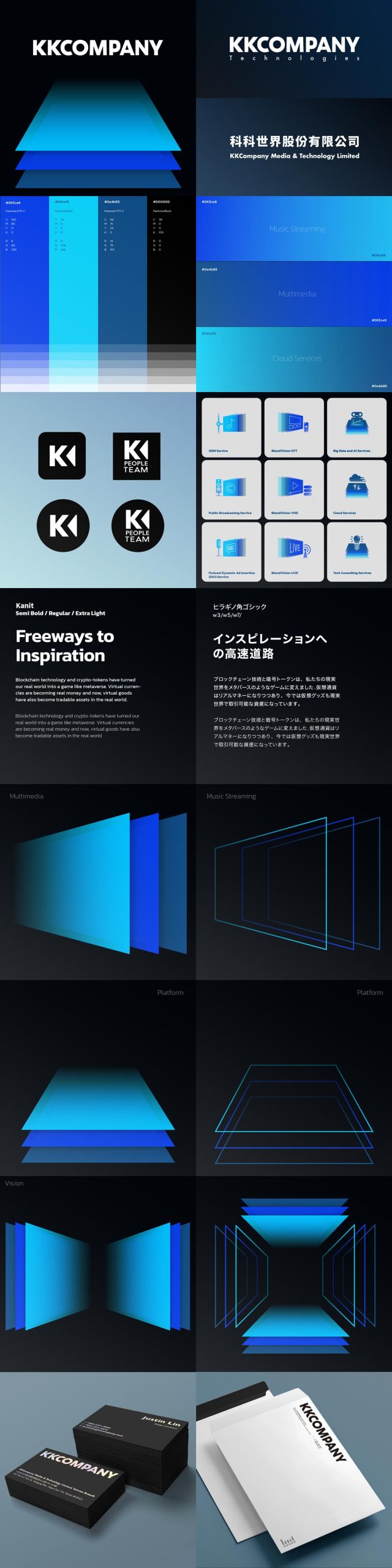
When the group was changed to KKCompany as corporation, I took over the pre-designed logo and made some typographic adjustment. And a new design language was defined according to the overall feeling of the logo and the new business structure.
3 panels with different grades of blue was designed corresponding to 3 product categories. When these panels arranged with perspective view are stacked together vertically, it represent the billboards at the side of the freeway as the visions seen along the path of innovation. When arranges horizontally, it symbols the levels of platform as the foundation behind streaming technologies
Please slide left or right to see more images.