KKLab visual identity
2020
In the end of 2019, KKBOX group has gone through a re-organization. KKLab is a new division separated from KKBOX music. KKLab act as a B2B company providing services to companies within KKBOX group, as long as other companies who seeks the streaming technologies and designs .
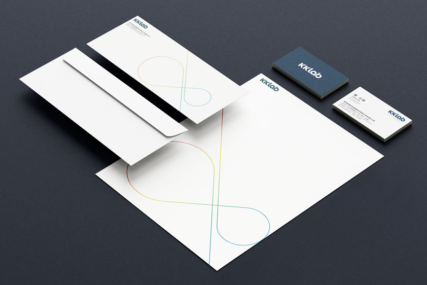
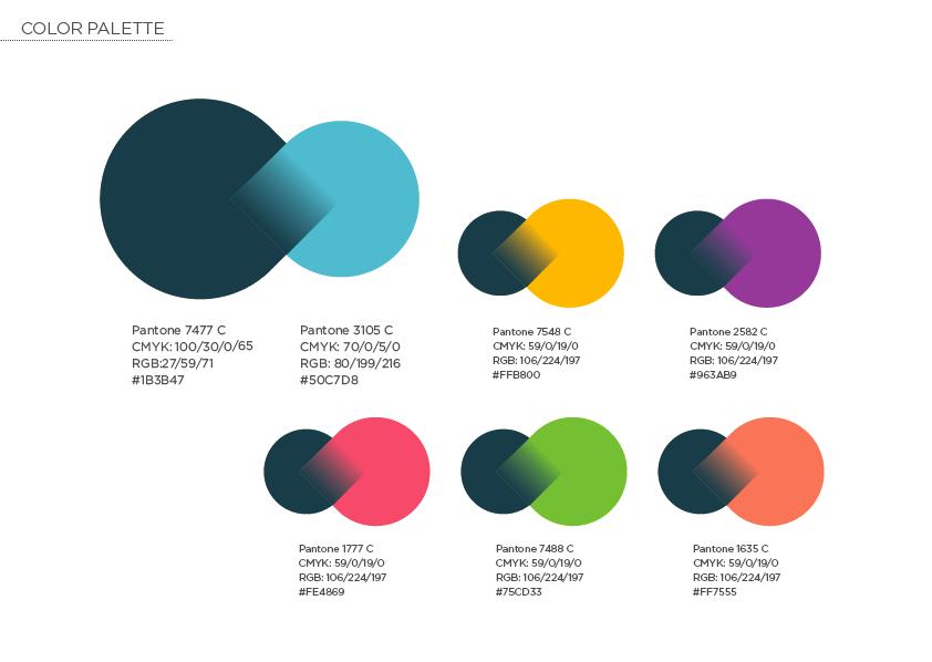
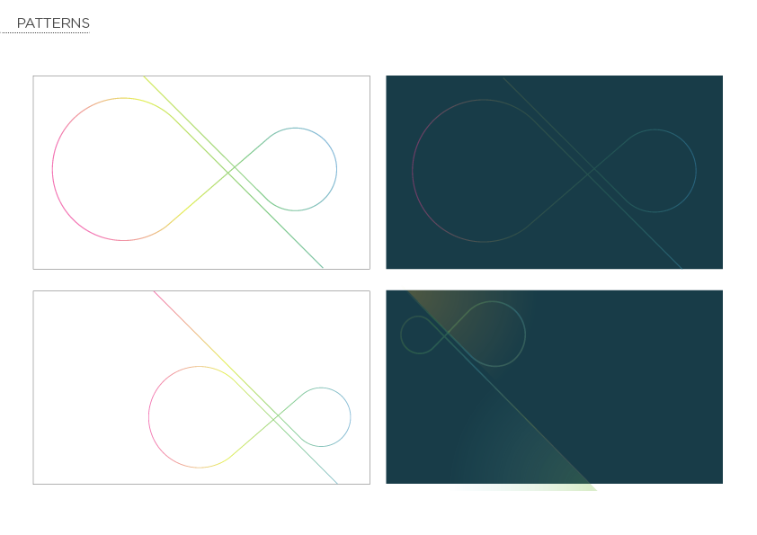
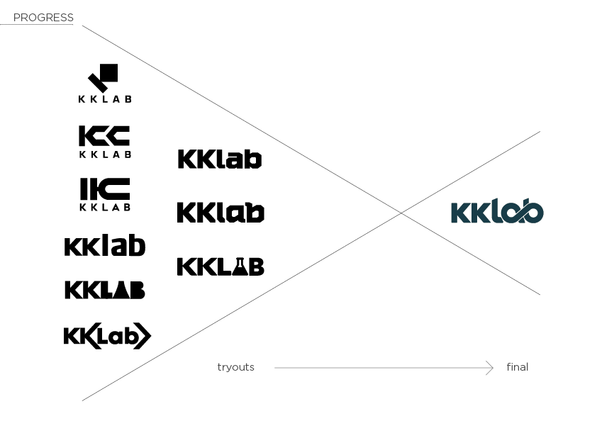
The logo design was chosen because of the infinity symbol made from letter “a” and “b”. I chose a neutral dark grey blue as the standard color to emphasize the reliability and professionality of the company.